Pants shopping has always been a gamble, especially if you're petite. Neishh's founder had a product that worked. What it didn't have was a personality.
We came in to give Neishh a visual identity and UX flow that matched how thoughtful the technology already was, turning a generic storefront into something women actually wanted to spend time with.
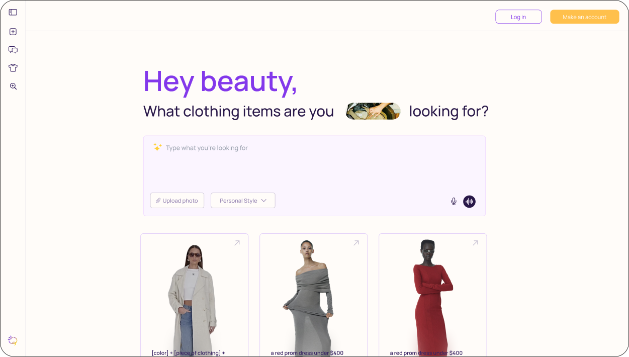
After defending the branding and a design system, we dived into analytics and the message was loud and clear. Users were dropping off before they even got "the" result. The problem was that nobody knew how to prompt.
We designed a prompt education layer that meets users right at the moment of friction: curated outfit examples they can tap, cozy, ready prompts, and a fill-in-the-blank formula using [ ] brackets so the path from "I don't know what to say" to "here's my perfect pair" is one soft away.
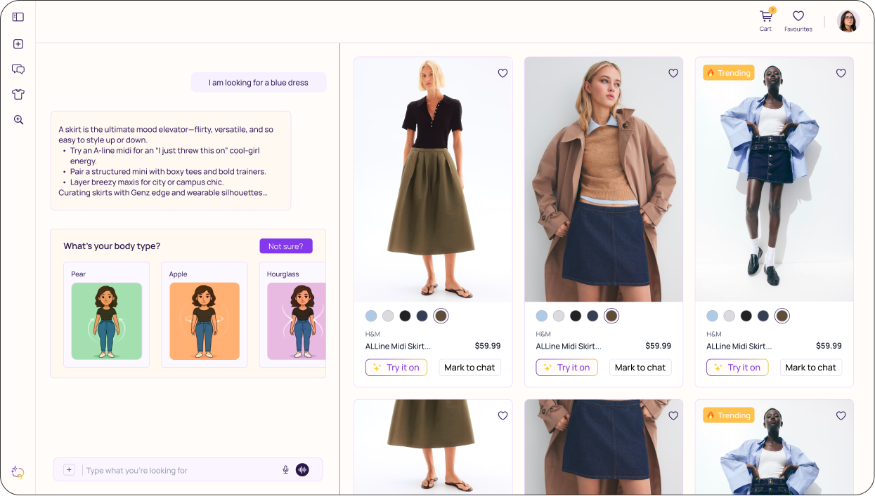
The original layout had everything it needed, it just wasn't saying it clearly.
We restructured the hierarchy, softened the visual language, and rewrote the UX copy to feel less like a form and more like a conversation.
The result is a design that holds all the original content, breathes easier, and has room to grow.
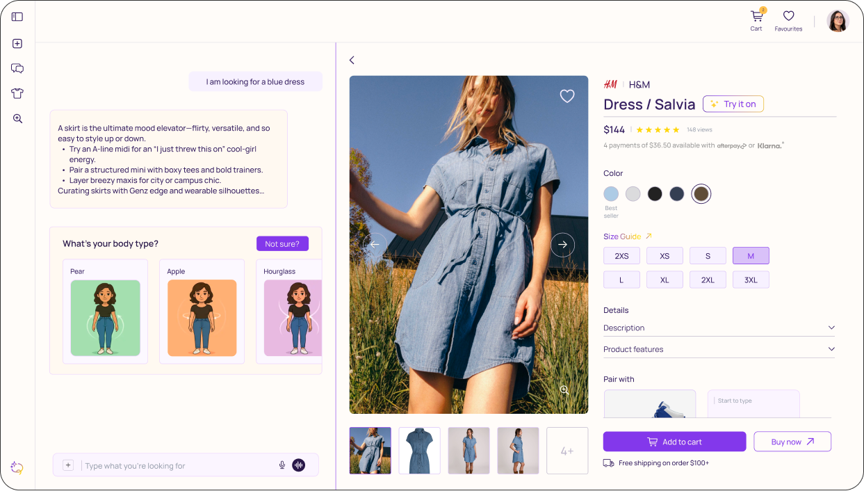
Why reinvent what already works? Instead of introducing new patterns, we leaned into the ones users already trust, then quietly beautified it more.
The new product page carries more information than its predecessor, organized in a way that feels completely natural. Less learning curve, more confidence at the point of purchase.
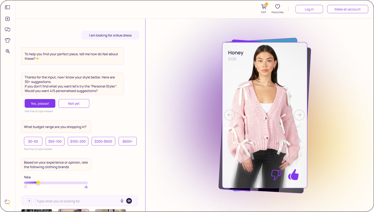
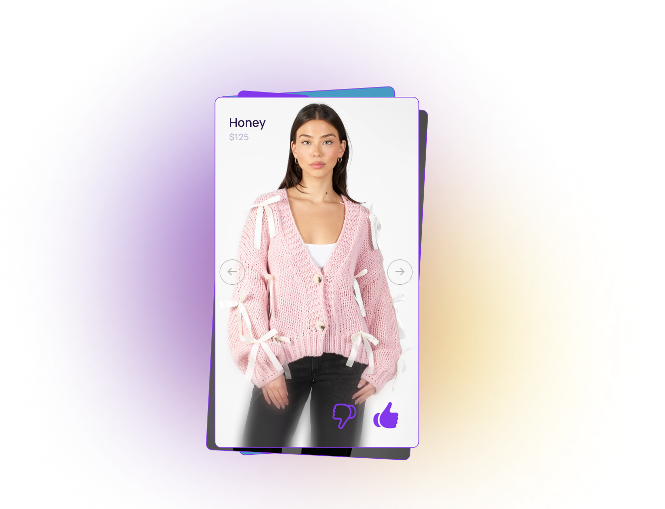
An app built to save you time shouldn't make you scroll for 30 minutes. Neishh's promise was effortless discovery, so we held it to that.
We introduced a swipe mechanic that lets users signal what they're drawn to, left or right, narrowing the listing in real time. Reducing decision fatigue, and resulting to the right pair.